My short film:


I also challenged sound extremely as through feedback from my target audience I got told the 'voiceovers' weren't effective. Therefore from this I took them out and replaced them with text on the screen. This challenges the normal convention of the genres as they usually always have dialogue. I have also turned all the clips sound off as I didn't want any backing noise.


My film poster:

I used 'Confessions of a teenage drama queen' a teen comedy by Walt Disney Pictures as the main inspiration for my film poster. There is a clear similarity between both posters. The conventions for a film poster are:
- masthead/title of film
- tagline/slogan
- image(s)
- billing/credits at the bottom
- release date
- logos
Firstly I used only 4 videos of her but added another video in the centre which pops up after. I filmed my character in her school uniform to show she is in school and to go and suit my mise-en-scene of the school rooms scenes.


Layout:
 I decided to only use 6 photos on my film poster as I though 9 photos would look too much and give away the synopsis of the film so I challenged this convention. I got the idea from the other textual analysis I did of a documentary film poster called 'Under Fire, Journalists in Combat' to use screenshots from the film than photos taken after as it doesn't relate to the film as well. I liked the use of colour in the first textual analysis as it suits the teen genre. Each photo has a different coloured background, I used a different screenshot for each which shows a different activity which are all different. E.g.
- art
- dance
- swimming
- London
- main character
- holiday
- Overall it makes the poster look very eye-catching and interesting.


-
I developed the layout of my film poster to see which look more effective. I did this by moving the text and images till it conveyed the teen genre clearly.
Here are some of the drafts:


Taglines/Slogans

- production companies
- starring actors and actresses
- music
- casted and written by
- director
- producer
After researching taglines and slogans I realised the short simple ones were the most effective so I tried making mine simple to suit the teen convention of taglines. I couldn't decide what tagline I wanted to use therefore I did a survey to see which my target audience preferred. There was a clear winner of 'the alleviation of stress'. I wanted my film to be called 'Stress' therefore I would repeat the word 'stress' twice on my poster as I include it in the slogan. Therefore developed the layout to put my slogan above my title which challenges the conventional layout as the title usually is before the tagline.
Title
Title
I used a more unconventional choice of font for my title as it is in the documentary style. Therefore I used a font called 'eraser dust' which is a detailed font which looks like someone sketched it. I thought this would relate to 'Beth's' hobby of art and gives a more personal look as it looks like my characters handwriting. I challenged the masthead as I made my title bigger than the existing poster's titles as my title was a single word and not a sentence.


Billing Block:
I used a very conventional billing credits at the bottom of my film poster, I created this at the start of the drafts and kept it the same through all the drafts as it looked like a real poster credits. There was a certain font the credits were wrote in on teen feature film posters, I found a font similar called 'amatic small caps' which was all in capitals and used this to make my poster conventional to the genre. I used the same order of what to write in the credits as the 'Confessions of a teenage drama queen' as it was a typical teen film which was successful and my target audience liked this poster. I included:
Underneath I used the same font and colour for the release date as it suited the rest of the colour scheme of the poster so far. I added a website link underneath to make it look as my film was real. The documentary poster didn't include the release date and the credits weren't effective so I challenged my credits to the documentary credits. But it is still conventional as I have included documentary and teen conventions together.
Logos
There were small logos of the production companies used in the existing film posters which indicated to me it was an important convention to include. I created the logos on a free website to make them look realistic, I chose to use the colour so they don't stand out and take away attention from the rest of the poster. I placed them at the bottom of the page as both film poster did this.
Logos
There were small logos of the production companies used in the existing film posters which indicated to me it was an important convention to include. I created the logos on a free website to make them look realistic, I chose to use the colour so they don't stand out and take away attention from the rest of the poster. I placed them at the bottom of the page as both film poster did this.

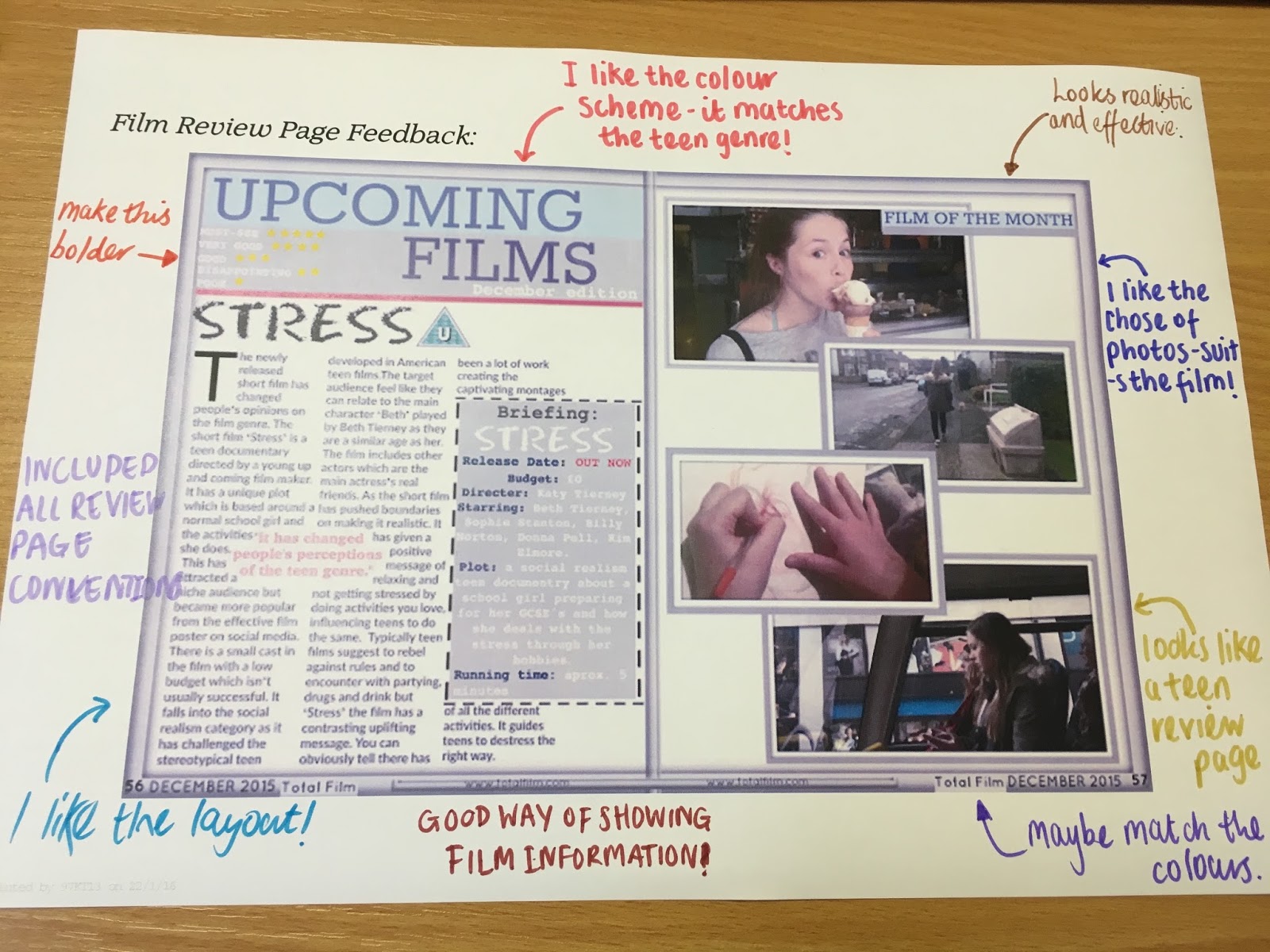
My final review page:

I researched many different film genres review pages to get an initial idea of what I wanted my review page to look like. When I made my review page I looked at the conventions I needed to include. E.g.

Some of the review pages I used as inspiration:
I liked the simplicity of the 'Spiderman 2' review page layout as the name of the film magazine and film name are bold and stand out and these are important parts to making a successful review page.

I realised that both 'Total film' magazine and 'Empire' magazine use a small section of the page say all the film's information, which is called a summary box. I thought this was an important convention to be able to show all of the information needed. I used the same sub title in the summary box as the 'Twilight' review.

My two main inspirations had different amounts of images on the review page. 'Spiderman 2' review page uses one large main image and then the 'Twilight' film review uses 4 different images. I looked at another review page 'Avatar' and analysed that they used 4 images. Therefore I thought it would be best to use 4 images than just one as My film can't be summarised into just one image.

For the review page I wanted a large film magazine name and film name. At first I wanted my magazine to be from 'Empire magazine' as I thought it would suit my film but the masthead is the same size as they font for the review making it hard to read therefore I developed it by changing the font size. I got inspired by the masthead of the 'Spiderman 2' review page one. I used a bold font for the film review title. I didn't want to copy 'new films' from 'Total films magazine' there I changed it to 'Upcoming films'. I used the same font for my film name from my film poster to make my film a brand identity and to make it recognisable. I hadn't seen any of the previous review pages do this so I challenged this convention. I added a small aspect on the right side saying 'Film of the month' as the 'Spiderman 2' page did this and it was my inspiration to help make mine professional and realistic.
Colour scheme:
When I first started making my review page I kept a plain white background but this wouldn't entice my target audience of teenagers. In the existing review pages each review had a different colour scheme depending on the film. Therefore I couldn't take much influence as my film wasn't the same genre as any of the examples. I challenged the colour scheme aspect by making my own to suit my film. I used the colours- blue, grey, white and coral pink and added coloured rectangles behind the title.
Film review star rating:
I was influenced by 'Total film' magazine to add a key of what the star ratings mean. I added this convention to the left side of the review name as extra information. I added the film rating as well as it is important to give information to the audience in order for them to go and watch it.

I planned my film review before putting it of the double page spread by following conventions. I decided to use a similar layout to the 'Spiderman 2' review page by positioning my review into 3 columns as I think columns make it easier to read. I then added the 4 images on the other side of the review page (to the right). I added grey borders around them to make it more interesting and the 'Avatar' review page has a bold black border making the images stand out and this is why I used this convention. I added a quotation in the middle of my review as two of the existing review pages did this and makes the reader want to read the rest of the review. I changed the font and colour to make it stand out from the rest of the text. I added a large 'T' at the start of the review articles as all of the existing film magazines I have looked at use this and shows the reader where the article starts and is an important aspect to make my film review page conventional. I added the small aspects at the end e.g. page number and issue date and magazine name on the bottom corners. I used a similar font to 'Empire' magazine as it was easy to read.
Overall:
I have used, developed and challenged conventions from existing products for my short film, film poster to my film review page. As I combined two genres together I had to combine both genres conventions together and using examples from each genre e.g. 'The Duff' and The 'camera. Therefore I challenged the conventions as I had to develop them to suit the 'teen documentary' sub genre. I had to do this in my two other ancillary tasks because I couldn't find any examples of teen documentary film posters or reviews. I used both genres convention with the stereotypical codes and conventions to create a realistic text that suits the genre. I developed many conventions by not using as many influences as they were not suited to my genre but I still got inspired by the layout and what top include.